
How to Pick the Best Neon Sign Colors for Your Space
Choosing the right neon sign colors can completely change how your message feels and looks. From bold reds to calming blues, each shade creates a different mood and impact. This guide will help you pick the perfect color based on purpose, setting, and personal style.
Quick Color Meaning Guide
Here’s a breakdown of what each popular neon color typically communicates — with practical tips on how to choose the one that truly fits your vibe.
Pink – Playful, Romantic, Youthful
Pink is the darling of custom neon signs — especially popular for weddings, bridal showers, and Instagram-worthy setups. It brings warmth and charm to a space without feeling too loud.
-
Use it when: you want your sign to feel flirty, feminine, or sentimental.
-
Perfect for: bedroom walls, beauty salons, proposal signs, or a sassy “Good Vibes Only” in your living room.
💡 Hot Tip: If your venue or wall has cool lighting, go for a warmer pink to keep the sign from looking too purple in photos.

Blue / Ice Blue – Calm, Cool, Modern
Blue gives off a sense of serenity and sleekness. “Ice Blue” is a trendy pick lately — it feels fresh, futuristic, and gender-neutral.
-
Use it when: you want a sign to look clean and chic without drawing too much attention.
-
Perfect for: minimalist branding, bar signs, gaming rooms, or baby showers (especially for boys).
💡 Ice blue looks almost white in bright daylight, so check both lit and unlit samples if your space has lots of natural light.

Red – Bold, Passionate, Attention-Grabbing
Red is the loudest voice in the room — and that’s the point. It’s powerful, emotional, and impossible to ignore.
-
Use it when: you want your sign to scream confidence or heat.
-
Perfect for: restaurants, nightclubs, tattoo parlors, Valentine’s Day events, or a “Be Mine” wall at home.
💡 Red looks incredible at night but can be hard to read from a distance if your background is dark. Make sure there’s contrast.

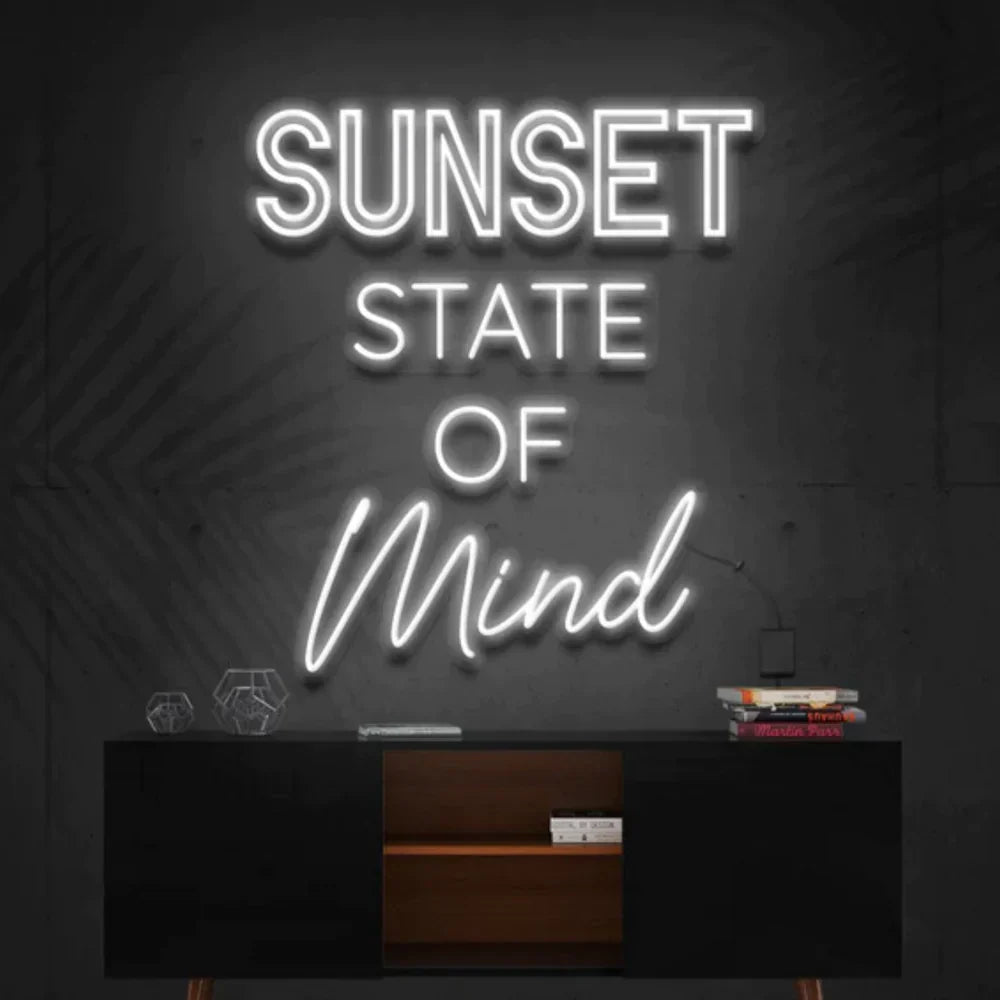
White (Warm / Cool) – Elegant, Timeless, Versatile
White is the little black dress of neon colors: it goes with everything. “Warm white” feels cozy and vintage, while “cool white” is modern and sharp.
-
Use it when: you’re unsure what color to pick or want something that complements everything else in the room.
-
Perfect for: weddings, interior decor, event names, or logo signs.
💡 Warm white flatters skin tones in photos — a big reason it’s so popular for weddings.

Yellow / Gold – Cheerful, Energetic, Friendly
Yellow stands out, even in daylight. It radiates warmth and positivity, making it a great choice for welcoming signs or joyful messaging.
-
Use it when: you want something that pops without being aggressive.
-
Perfect for: cafes, motivational quotes, kids' rooms, or sunny corners of your home.
💡 In dim spaces, yellow can sometimes look slightly greenish — check photos of real signs before you decide.

Purple – Mystical, Luxe, Creative
Purple is both soothing and a little mysterious. It feels premium, slightly magical, and different enough to be memorable.
-
Use it when: you want something bold but not basic.
-
Perfect for: beauty spas, creative agencies, bedroom signs, or moody bars.
💡 Purple shows up best in low-light rooms and adds a moody glow to any background.

Green / Mint / Lime – Fresh, Clean, Natural
Green is energizing and grounded. Depending on the shade, it can feel lush (deep green), zesty (lime), or cool and breezy (mint).
-
Use it when: you want to bring freshness or a botanical vibe to your space.
-
Perfect for: plant shops, juice bars, kitchen decor, or eco-conscious brands.
💡 Mint green can feel nearly white in strong lighting — best viewed in cozy indoor settings.

Feeling Torn?
It’s totally okay to love more than one. Many people ask for photo samples or even order small color samples before deciding. When in doubt, think about:
-
Where will this be used? (Indoor vs. outdoor, bright vs. moody lighting)
-
What emotion do I want people to feel when they see it?
-
Do I want the color to blend in or stand out?
How to Pick the Right Hue for Your Setting
Choosing the right neon color isn’t just about what looks good in a vacuum — it’s about what works in your specific space, purpose, and lighting. The same pink sign that looks stunning in a bridal suite might feel totally out of place in a law office. That’s why this section helps you match color with context, so your sign doesn’t just glow — it makes sense.
For Weddings & Events
Weddings are the most emotional and personal use-case for neon signs — you want the color to feel intentional, not random.
Top choices:
-
Warm White – timeless, soft, and looks amazing in photos
-
Blush Pink – romantic and playful, great for photo booths or backdrops
-
Cool White or Ice Blue – if your wedding is minimalist or winter-themed
Tips:
-
Match the sign color to your overall wedding palette (e.g., ivory + gold = go with warm white or soft yellow).
-
Consider lighting: outdoor weddings or daytime receptions may wash out lighter colors, while indoor venues make soft hues pop.
-
If it’s going behind a couple's table, pick a color that contrasts with the backdrop (e.g., don’t do white on a white curtain).
💡 Bonus idea: Add a color-changing RGB feature if you want a more dynamic photo booth or dance floor sign.
For Businesses & Brands
Neon signs for businesses carry identity weight — they're part of your branding, not just decor. The color must align with your tone, industry, and target audience.
Common matches:
-
Red / Yellow – bold and eye-catching for restaurants or retail
-
Cool White / Ice Blue – clean and modern for tech or design studios
-
Purple / Deep Blue – premium and creative for salons, spas, or agencies
-
Green tones – great for sustainability-driven or wellness brands

Tips:
-
Think of brand consistency: Does this color appear in your logo or packaging?
-
Choose readability over aesthetics — especially for window signs or street visibility.
-
If you’re open at night, test how the sign looks from the sidewalk. Some colors (like red) blur more easily through glass.
💡 Pro tip: Cool white or warm white logos often look more expensive than colored ones, even in fast-paced settings.
For Interior Decor (Home or Office)
Here, your neon sign becomes part of the atmosphere. Color choice should blend with your interior style, but still feel intentional.
Aesthetic fits:
-
Minimalist rooms – cool white, ice blue, or mint green
-
Cozy spaces – warm white, soft pink, or deep amber
-
Eclectic / Maximalist – go wild: hot pink, neon green, or purple
-
Gaming rooms – ice blue, red, or RGB signs
Tips:
-
What color is your wall? Contrast matters. A white sign on a white wall disappears.
-
Will it be on all the time? Go for a soothing hue you won’t get tired of.
-
Consider the size and brightness: vibrant colors in small rooms can be overwhelming.
💡 Design tip: If your room has LED strips or other lighting, pick a neon color that complements — not competes with — existing tones.
For Temporary Displays & Parties
If the sign is for a short-term event, you can go all in on vibe without worrying too much about long-term harmony.
Fun picks:
-
Hot Pink / Red – for bachelorettes, birthdays, or bold themes
-
Color-changing RGB – keeps energy high without commitment
-
Lime Green / Bright Orange – for 90s or retro-themed parties
💡 Rental or not, always check how the sign looks when unlit — especially if it’s going to be seen during daylight hours.

Quick Reminder: Color + Setting = Storytelling
A neon sign is more than a glow — it tells people what they’re walking into.
-
Weddings: soft, warm, romantic
-
Brands: bold, consistent, strategic
-
Homes: balanced, mood-friendly
-
Parties: loud, fun, unafraid
So before you pick a color, ask yourself:
-
Where will this sign live?
-
What do I want the space to feel like when it's on?
When the color fits the setting, the whole sign feels like it belongs — and that’s what makes it unforgettable.
What You Need to Know About Day vs. Night Appearance
Most people fall in love with a neon sign after seeing it glowing at night — but then they get it, hang it up, and realize:
“Wait… why does it look so different during the day?”
This is something few buyers think about upfront, but it can make or break your experience with a custom neon. In this section, we’ll break down how lighting, background, and even neon tube materials affect your sign’s look in different conditions — and how to choose a color that still works 24/7.
What Your Neon Sign Looks Like During the Day
During the day — especially in rooms with lots of natural light — neon signs may:
-
Look less bright or even washed out
-
Display more of their tube color (the acrylic or silicone when unlit)
-
Blend into white or bright walls unless there’s strong contrast
Some colors like ice blue, mint, or soft pink can appear almost white or barely visible in sunlight. Meanwhile, bold colors like red, orange, or deep purple still hold their tone.
How to Make Daylight Work for You:
-
Choose higher-contrast colors if your space is sunlit or outdoors
-
Place signs on darker walls or with a backing panel to increase visibility
-
If you're hanging it on a white curtain (like at a wedding), go for warm white, hot pink, or red — not ice blue or soft yellow
📝 Helpful tip: Ask your sign provider for real-life photos of your color in daylight. The digital mockup is never the full picture.
What It Looks Like at Night
Night is neon’s time to shine — literally. In low light or darkness, neon signs:
-
Appear vibrant and glowy
-
Have a stronger emotional impact — especially for events or photo backdrops
-
May reflect against nearby surfaces (which can be beautiful or distracting)
The color intensity increases, and the surrounding light can even take on a hue — for example, a red neon sign might tint your entire wall slightly pink or amber.
How to Make the Most of Neon at Night:
-
Use neon signs as your main lighting source for cozy, ambient rooms
-
If you want a more gentle nighttime vibe, avoid super bright colors like lime green or white in small bedrooms
-
For photos or videos, avoid directly lighting the sign with other sources (like LED spots) — it ruins the glow
Real talk: A soft pink neon on a darker wall under no overhead light = chef’s kiss for your Instagram.
What You See Online ≠ What You Get IRL
One of the most common reasons for color disappointment is that people expect their sign to look exactly like the online preview — all the time.
But:
-
Some brands use over-edited product photos
-
Your screen brightness and warmth change how you see color
-
Your sign’s environment matters way more than you think
Ask before you buy:
-
Can I see photos of this color in different lighting?
-
Is there a video or showroom of this sign color in action?
-
Do you have a color swatch kit I can borrow or buy?
If a brand can’t help you visualize what it looks like day vs. night, consider that a red flag.
Mistakes to Avoid When Picking Neon Colors (And What to Do Instead)
You’d think choosing a neon color would be easy — just pick the one you like, right? But when it comes to custom signs, small decisions can have unexpected consequences. Over the years, we’ve seen the most common regrets come from people who didn’t think about how their color would actually live in their space.
Let’s walk through the top mistakes people make when picking neon colors — and how you can avoid them with confidence.
❌ Mistake #1: Picking a Color Based Only on a Mockup
That digital preview on your screen? It’s a starting point — not the final look. Every screen is calibrated differently, and most mockups are shown in a dark setting, which makes colors look way more vibrant than they may appear in real life.
✅ What to do instead:
-
Ask for photos or videos of actual signs in that color
-
If possible, see the sign in daylight and nighttime settings
-
Request a color swatch or sample from your provider if you're unsure
💡 Pro tip: A mockup might show pink as electric — but in real life, it could be soft and subtle. Always confirm.
❌ Mistake #2: Ignoring Your Wall Color or Background
A gorgeous neon sign can look totally underwhelming if it blends into its background. For example, a white sign on a white curtain or pale wall will disappear when it’s off — and may barely stand out when it’s on.
✅ What to do instead:
-
Choose a color that contrasts your wall or curtain
-
Consider a backing board or cut-out acrylic shape if your background is light
-
Think about how your space will be lit at different times of day
💡 Design trick: Pair a white neon with a bold-colored wall, or a warm-toned neon with a cool backdrop for maximum contrast.
❌ Mistake #3: Going with a Trend Without Thinking It Through
Trendy colors (hello, millennial pink) are everywhere right now — and while they look great on Pinterest, they might not feel like you long-term.
✅ What to do instead:
-
Ask yourself: “Will I still love this color next year?”
-
Match with your personal or brand style, not what’s popular
-
If you're unsure, white, warm white, or gold are timeless
💡 Hot pink may scream now, but warm white whispers forever.
❌ Mistake #4: Choosing a Color That's Too Dim or Too Harsh for the Space
Some colors, while beautiful, may not perform well depending on where the sign is placed. Soft yellows and mint greens can feel faded in bright rooms. Meanwhile, icy white or lime green might be too intense for cozy corners or bedrooms.
✅ What to do instead:
-
Think of lighting and space size: bright rooms need bold colors, dark rooms can support subtler tones
-
Consider who the sign is for: a sign for a baby’s room vs. a gaming room will need a different vibe
-
If brightness matters (e.g., window signs), ask your provider which colors are most visible
💡 If the sign will be on a lot, avoid eye-straining colors like sharp white in small, dark rooms.
❌ Mistake #5: Forgetting About What It Looks Like When Turned Off
Neon signs don’t stay on 24/7 — so it’s worth thinking about what they look like during the off hours, especially if it’s in a high-visibility area.
Some colors have a very visible tubing color when off (like red or green), while others like warm white can be almost invisible.
✅ What to do instead:
-
Ask for unlit photos of the color
-
Choose a tubing color that doesn’t clash with your space
-
Consider getting a colored acrylic backing to keep it looking nice even when off
💡 Don’t treat your sign like it disappears when it’s off — it’s still part of the room’s visual story.
Trending Neon Colors in 2025
Every year, neon sign trends shift — and 2025 is no different. But here’s the good news: you don’t have to chase every trend to make a great choice. The smartest buyers know which colors are peaking right now, and which ones will still feel fresh years down the line.
Whether you want to stay on-trend or play it timeless, this guide will help you decide.
Hot Neon Color Trends in 2025
1. Ice Blue
-
Why it’s trending: Minimalist, futuristic, and gender-neutral. A big hit for modern weddings and home offices.
-
Best for: Sleek interiors, bar signage, cool-tone wedding decor
-
Caution: Can appear very pale in bright rooms; works best indoors
2. Warm White (Over Cool White)
-
Why it’s trending: Feels cozier, softer, and more flattering in photos — especially for weddings and intimate venues.
-
Best for: Event signage, boutique stores, anything romantic
-
Caution: Slightly dimmer than cool white, but worth the trade for ambiance
3. Soft Peach / Blush Pink
-
Why it’s trending: A more muted alternative to millennial pink; sophisticated yet still sweet
-
Best for: Wedding names, beauty salons, cozy cafes
-
Caution: Low contrast in bright daylight — best indoors or at dusk

4. Neon Lime & Acid Green
-
Why it’s trending: Gen Z loves bold, unapologetic shades — this color screams playful rebellion
-
Best for: Parties, pop-up shops, content creators
-
Caution: Can overpower a room if overused; best in small doses
5. Purple (Especially Lavender Glow)
-
Why it’s trending: Feels dreamy, spiritual, creative — and looks stunning in moody lighting
-
Best for: Creative spaces, meditation rooms, events with ambient lighting
-
Caution: Can look dim in well-lit rooms or with warm-toned backgrounds
Timeless Neon Colors (That Never Go Out of Style)
These are your ride-or-die hues — no matter the year, the mood, or the trend cycle, they always work.
✅ Warm White
-
The ultimate neutral. Glows soft, reads clear, photographs well. If in doubt, start here.
✅ Red
-
Bold, iconic, powerful. Great for signs that need to demand attention, like bars or vintage aesthetics.
✅ Hot Pink
-
A classic in the neon world. Still playful, still strong, and instantly recognizable.
✅ Yellow/Gold
-
Feels joyful and luxurious at once. Pairs well with natural tones and adds instant warmth.
✅ Cool White
-
Crisp, modern, and versatile. Perfect for clean branding, contemporary homes, and signage that needs to pop.
What This Means for You
Trends are great — they spark creativity and reflect what’s culturally “in.” But remember:
You’re not buying this sign for Instagram. You’re buying it for you. And what’s hot right now may not feel right six months from now.
That’s why the best approach is to ask yourself:
-
“Do I love this color for the space it’s going in?”
-
“Will this color still feel like me when the trend fades?”
-
“Does it complement the story I want this sign to tell?”
If the answer is yes, then congratulations — you’ve already found your perfect color.
Neon signs are one of the most personal design choices you’ll make. They’re not just decorations — they’re emotional anchors. Whether you're lighting up a wedding, launching your brand, or giving your home a little glow-up, color is how your sign speaks before anyone reads a word.
So choose the color that makes you smile, makes your space shine, and tells the story you actually want to tell — in your light.
Checklist: Factors to Consider When Choosing Neon Sign Colors
Use this list before placing your order to make sure your neon sign looks exactly the way you want — both online and in real life.
Purpose & Emotion
-
What message or feeling do I want the sign to convey?
(e.g., romantic, bold, calming, professional, playful) -
Who is the sign for?
(myself, guests, customers, social media viewers)
Location & Lighting
-
Will the sign be used indoors or outdoors?
-
Will it be seen mostly in daylight, nighttime, or both?
-
Is there a strong light source nearby (sunlight, lamps, LED strips)?
-
Does the room have warm or cool lighting overall?
Background & Wall Color
-
What color is the wall, curtain, or backdrop behind the sign?
-
Does the sign color have enough contrast with the background?
-
Should I add a backing board for visibility or design?
Appearance (On & Off)
-
Have I seen photos or videos of this color lit and unlit?
-
Do I like how the tubing or acrylic looks when the sign is off?
-
Am I okay with how bright or subtle the color is?
Style & Longevity
-
Is this color a passing trend, or something I’ll love long-term?
-
Does the color align with my brand, home decor, or event style?
-
Will I still like this in 1-2 years?
Practical Considerations
-
Will the color show up well in photos and videos?
-
Is the color bright enough for visibility in the setting?
-
Am I choosing this color because I love it — not just because it’s popular?
Optional, But Worth Asking:
-
Can I see sample photos in a similar setting to mine?
-
Is there an option to test or preview colors in person?
-
Does the provider offer color swatches or a guide?
Pro Tip: Print or screenshot this checklist when you browse neon color options — it'll help you make a decision that looks good now and still feels right later.
Frequently Asked Questions About Neon Sign Colors
What color are neon signs?
Neon signs come in a wide range of colors, but the classic neon color is a bright red-orange, which is the natural glow of neon gas. Other colors are created using different gases or colored glass tubes.
How to get different colors in neon signs?
Different colors are achieved by using various gases (like argon, krypton) and phosphor coatings inside the tubes, or by using colored glass. In LED neon signs, colors are created using RGB LED lights and color filters.
What is the best color for neon?
The best color depends on your purpose. Warm white, pink, and ice blue are popular for weddings and home decor, while red and yellow are great for grabbing attention in business signs. Choose based on contrast, mood, and visibility in your setting.
What is neon's original color?
The original and only natural color of true neon gas is a reddish-orange glow.
Can any color be neon?
Technically, no — only the reddish-orange glow is true “neon.” But in modern usage, “neon colors” refer to any bright, glowing colors produced using different gases, coatings, or LED technology.
Are neon lights expensive?
Traditional gas neon lights can be expensive due to custom glasswork and energy use. However, LED neon signs are much more affordable, energy-efficient, and longer-lasting — making them a popular alternative today.
Conclusion
The right neon sign colors do more than glow — they communicate, captivate, and complete your space. With a bit of thought, your color choice can turn a simple sign into something truly memorable. Choose wisely, and let your sign speak in the perfect light.
3 comments
Tyrell Mcelrath
I’m looking to get a neon sign done like the Tommy Hilfiger logo but I need it to say Tybudd Hildabber do you think this can be done?
I’m looking to get a neon sign done like the Tommy Hilfiger logo but I need it to say Tybudd Hildabber do you think this can be done?
Owen
It looks good with almost anything and it’s just so cool to look at. The dimmer is also a huge plus
It looks good with almost anything and it’s just so cool to look at. The dimmer is also a huge plus
Advert and Signs
Dear Orant Neon,
I recently read your blog post on “Neon Sign Colors” and found it to be an informative and helpful guide for anyone looking to create a unique and eye-catching neon sign. The post provides excellent insights into the various colors that are available for neon signs and how they can be used to create different moods and styles.
I appreciated the way you have explained the technical aspects of neon sign colors, such as the different types of gases used to create different colors and the impact of the glass tube color on the final appearance of the sign. Your post also provides helpful examples of how different colors can be combined to create unique and effective designs.
Overall, I found your blog post on neon sign colors to be a valuable resource for anyone looking to create a unique and effective sign. Your insights on the technical aspects and practical considerations of neon sign colors are very helpful. Thank you for sharing your knowledge and expertise on this topic.
Best regards,
Advert and Signs